I absolutely love challenges that start with the phrase “Can you paint….?” In this case, the question was: “Can you faux paint a plaster wall to look like concrete?”
Yes!
My client is opening a restaurant soon in Sutton, MA – and the designer had the concept of making the main wall of the space look like concrete with a section of exposed brick. After lining up the mason and plasterer, the designer called me to see if faux-painting could make her vision a reality.
After visiting the space and talking with the designer and restaurant owner, I had a great sense of what they were looking for. I started by studying concrete wherever I went, looking at my color books and taking notes. I then started the process of collaborating with the designer on the colors that would make up the concrete look (I ended up using 5 different colors!). To go with the floors and clearly read as “concrete”, we needed grays, but we also wanted to keep some warmth in the colors to help create the rustic (and realistic!) feel they were going for.
When the plaster work was complete, I was on to my painting! I started with the lightest of my warmer colors as the base paint, and then added my first layer of texture/patterning in a darker warm tone. When this was dry, I was able to go back through with the grays to make the mottled look you see here.
Between the mason doing the brick work, the plasterer and my faux painting – we were able to nail the look they were going for! Now I can’t wait to see the rest of the work completed and the space completed for the restaurant opening.
Enjoy,
Jason
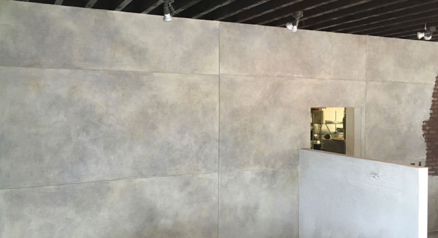
A section of the finished wall
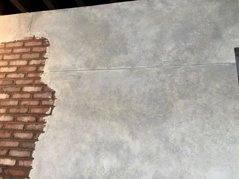
Detail of final result

The first steps! (just base color at top right, adding first layer of texture)

With the grays added
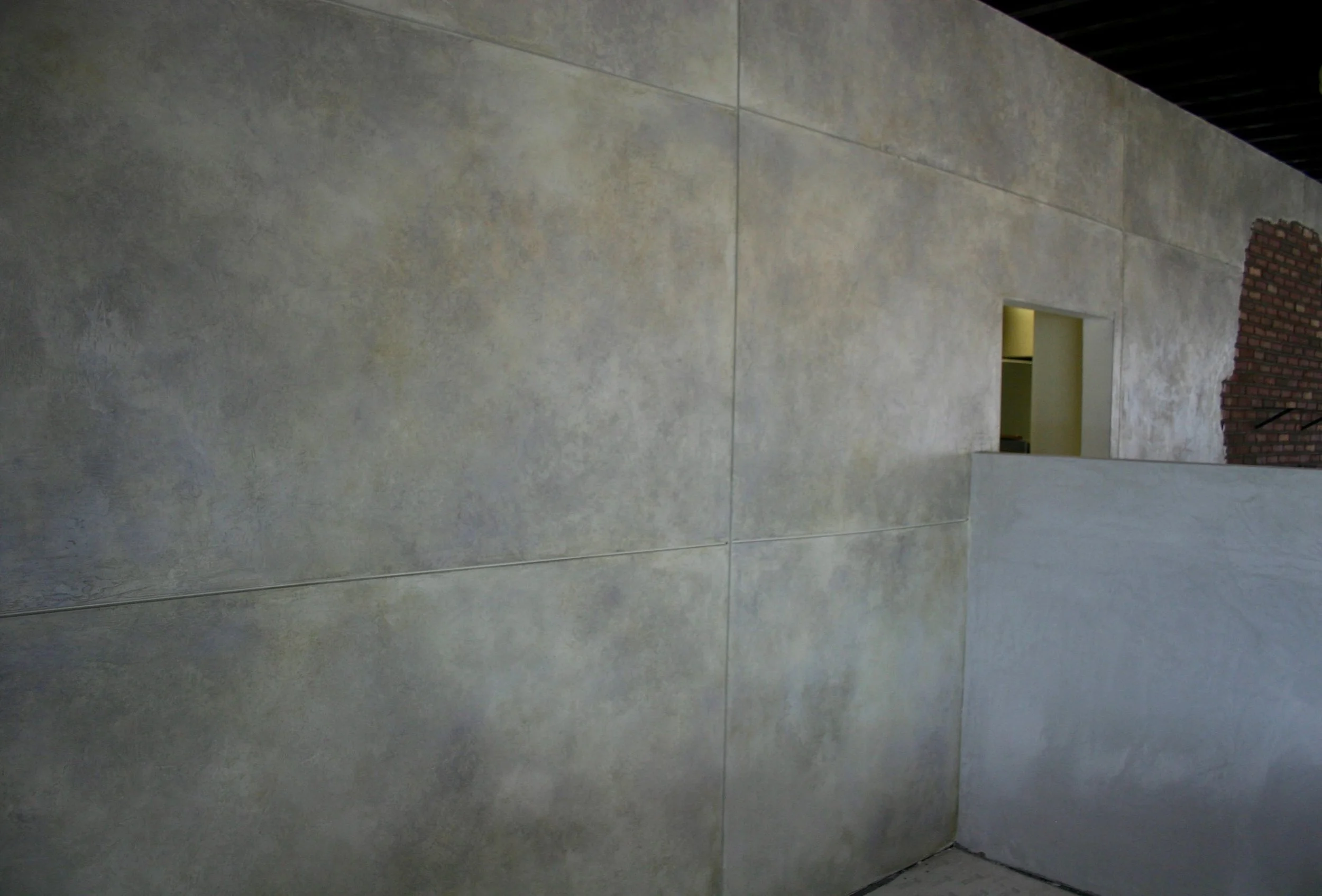
Table view!